← Back to the overview article
How to design a clear, readable digital menu
Turn your menu text into a clear screen display, then test it in your restaurant. This guide shows how to make dishes, prices and included side dishes easy to find.
1. Give the menu one job
Start with a specific task: helping guests choose between two lunch specials. They need to know the dish, its price and what is included. Opening hours, events and the full dinner menu may need a separate display. Write down the purpose: “Show today’s two lunch specials, with prices and included side dishes.” Use that purpose to decide which information belongs on the screen.
2. Shorten the text without losing key information
Split the paragraph below into two clearly separated dishes. List the side dish once underneath if it is included with both. This lets guests find a dish without reading the whole paragraph. Keep the details they need to choose, including relevant ingredient and allergen information. The example below does not provide a complete set of those details.
Today we offer a Pizza Margherita with tomatoes, mozzarella and fresh basil for CHF 18.50, or penne with seasonal vegetables in tomato sauce for CHF 19.50. Both dishes come with a small mixed salad.
3. Establish a simple hierarchy
Heading first: “Today’s lunch” tells guests what they are looking at. List each dish and price below it, followed by a brief description in smaller, legible text. Assign prices clearly: place each price beside the dish it belongs to. Avoid a separate price list and use the same currency format throughout. Leave space: leave enough space between dishes to keep their details distinct. If the menu only fits with very small text, shorten it or divide the content.
4. Implement it in SUISSE-VIDEO
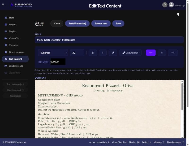
Open the text content for your menu. Add the heading, dishes and prices, then set the font size, text colour and background. Use a table to align dishes and prices in columns, and check how it appears on the screen. A plain, light background with dark text is a useful starting point. Other colours can work too, provided the text is easy to read in your restaurant. Keep busy patterns, photos and borders out of the text area. Finally, schedule the menu in your project.
Step-by-step guide & 14 menu templates →
5. Test on the actual screen
There is no single font size that works for every restaurant. Screen size, viewing distance, lighting and the amount of text all affect readability. Check the display from where guests will actually read it, and repeat the test as daylight changes. If reflections obscure the text, you may also need to adjust the screen position.
- Display the menu on the intended screen.
- Stand at the counter, entrance or intended viewing position.
- Ask another person to identify a dish, its price and the side dish without an explanation.
- Ask which line was hard to read or unclear.
- Adjust the font, spacing or amount of text and repeat the test.
6. Decide how to display longer menus
SUISSE-VIDEO can scroll longer menus automatically. This lets you display more text, but guests have to wait for the section they want. Two daily specials are often easier to read on a single screen. If you use scrolling text, check that each dish and its price remain visible together long enough to read.
Pre-launch checklist
What this design is intended to achieve
The aim is to help guests find the available dishes and their prices quickly. Observe whether the clearer layout reduces questions in your restaurant. It does not, by itself, demonstrate an increase in sales.